Holiday Sign Strategies: How to design a successful sign

December is a critical time for many businesses. It marks the end of the fourth quarter and a final opportunity to boost revenue and achieve strong sales before the end of the year. A positive holiday season can transform a good year into a great year if businesses know how to capitalize on the opportunity. It’s important for many businesses to develop a plan for their indoor signage. Signs that are strategically placed can enhance the shopping experience, guide customers through the store, and maximize impulse buys. It’s also essential to design eye-catching signs that will stand out to draw a crowd.

This article will discuss successful design elements and how to make your seasonal sign effective to maximize sales this holiday season.

What makes a successful design?

There are several key characteristics that make a successful design. The top five design elements are:

  1. Capture their attention with holiday graphics – Highlighting themed imagery with family gatherings and celebration invokes nostalgia. Create a warm and inviting atmosphere by tapping into the emotions of your customers to make the holidays seem special.
  2. Use Simple yet effective colors – Incorporating colors such as red, green, silver, blue, and gold evoke the season’s spirit.
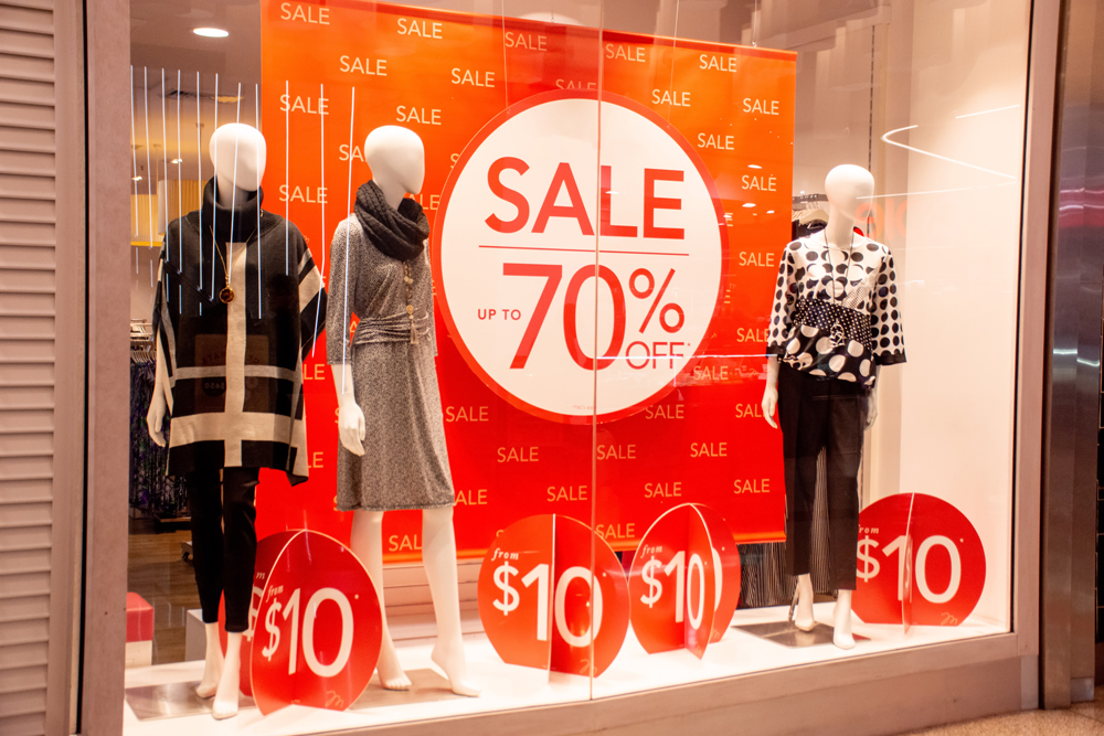
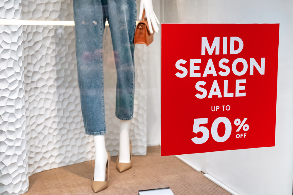
  3. Use Clear, easy to read text – Clarity is key when designing an effective holiday sign. Shoppers are in a hurry and they do not have time to solve complex offers. Use bold, easy to read fonts, and keep the message concise. Focus on the discount and the deal to give the customer the information they want quickly.
  4. Use different shapes and sizes – Use different materials and create signs in all shapes and sizes to draw attention from all angles. Experiment with attention grabbing shapes such as arrows, stars, or spheres decorated to resemble a holiday ornament.
  5. Highlight your brand – Adding your brand colors to holiday graphics is an effective method to grab attention, captivate, and help your customers remember your business.
Holiday Sidewalk Sign and Window Decal

How to make your seasonal signs effective.

Businesses can design and produce several eye-catching signs, however; the sign must be visible and placed effectively to produce a sale. When maximizing the effectiveness of your signs, remember the following:

  1. Plan Ahead – The holidays occur once per year and they roll through quickly. It is in every store’s best interest to prepare early and have their signage ready for the holidays. Read more about what signage will work for your business so you will be ready for the holidays.
  2. Spotlight your message with lighting – Take advantage of shorter days and early dark evenings with decorative lights. Use interior and exterior lights to brighten up your signs and grab attention. Choose your colors wisely by matching holiday colors along with the store brand.
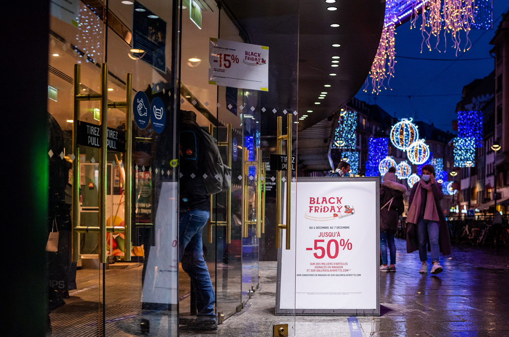
  3. Strategically place each sign – Ensure there is a direct line of sight for each sign. It is best practice to place signs at eye level to draw the attention of the customers. Place signs with the best offers in high traffic areas to pique your customers interest for both indoor and outdoor signs.
  4. Lead Your Customers – Make it easier for your customers to find your store and guide them to make a purchase. Setup exterior signs such as banners, sidewalk signs, and window signs to help your customers find your location. Setup directional signs such as floor decals and interior signs to direct them around the store and guide them to the checkout.
  5. Use your window space effectively – Use your windows to your advantage. Hanging window signs, decals, and perforated window signs highlighting holiday sales are excellent tools to capture the attention of passerbyers and entice them to enter your store.

Do you want to take full advantage of the holiday shopping season and grow your business? The experts here at Creative Sign Inc. can design an eye-catching sign to make you stand out from the competition. We can also help you develop a festive holiday layout for your store to increase sales. Contact us today to plan for a successful holiday season.

Holiday Signs: Create seasonal displays to maximize holiday sales

Owners of brick and mortar locations understand the need to strike when the iron is hot. Businesses strike with their holiday signs and banners to draw a crowd to their location. They strategically place their signs at the right place during the holiday season, when it’s hot, to maximize foot traffic and generate sales.

Why is it necessary to keep holiday signage in inventory?

The holiday season rolls through quickly at the end of the year. Stores setup signs and displays in October to promote Halloween decorations and costumes. These displays are quickly taken down in the blink of an eye the day after and new signs are set up to bring in the warmth of Thanksgiving. This signage lasts for the month of November until the day after when the festive season of Christmas arrives.

Availability is key to maximizing holiday sales

Businesses must have their signage and displays designed, produced, and ready to react quickly to the changing holidays. There are many types of displays to choose from such as floor graphics, point of purchase displays, accessories stands, window decals, and more. What are the best graphics to maximize sales during the holidays? That’s where the professionals at Creative Sign Inc. are here to help.

This article will examine your options and discuss what seasonal signage will work for your business so you will be ready for the holidays.

What are the best signs to draw attention?

Seasonal holiday signs have two goals. The first goal is to catch the eye and draw the attention of potential shoppers. This will drive foot traffic to your business. The second goal is to promote the products and generate the sale of the items you want to move. Here are a few types of signage to consider:

Banners – Large format banners are an excellent medium to capture the attention of potential customers at a great distance. Nothing pulls in a crowd to your business like a banner with full color graphics, your messaging, products, and logo.

Window Signs – These displays are one of the most effective and easiest to switch out as one season ends and another begins. The window sign can announce your upcoming Black Friday sale throughout the month of November and quickly switch out to promote your Christmas sale for the month of December in a flash. This builds up potential foot traffic for the Friday after Thanksgiving and sustains it through the Christmas season.

Window Signs

Window Decals – Adding window decals to any storefront is an excellent method to announce holiday sales, promotions, and increase foot traffic. Custom designs will get potential customers into the holiday spirit. Replace older window decals with new business hours to inform potential customers of expanded store hours.

Window Decal

Perforated Window Signs – Allows an image to be seen on one side while appearing transparent from the other side. Utilize the entire window space to promote the sale while allowing natural light to flow into the building. Let customers see outside while still promoting your business.

Sidewalk Signs – These signs are also known as A-Frames and are perfect for grabbing the attention of people who would normally pass by the business and turn them through the front door. Promote holiday sales by displaying a powerful attention-grabbing design with a display right in front of the business.

Here are a few types of indoor signage to consider:

Floor Graphics – Use the space on the floor to promote holiday sales and create awareness in new products. Decorative holiday themed floor decals can boost the holiday spirit to visiting customers. They can also direct traffic to specific areas of the business where the seasonal deals exist.

Point of Purchase Displays – Outdoor signage brings in foot traffic, however; Point of Purchase displays turn those visitors into customers. Business owners can strategically mark spots to encourage impulse buys, highlight holiday sales, and influence buying decisions. Creating a colorful Point of Purchase display to stop “just browsing” customers in their tracks.

Retractable Banners – Announce holiday sales and promotions with retractable banners. Designed for quick and easy assembly, these banners are highly convenient. They can be stored away without taking up too much overhead. When the holiday season arrives, they can be deployed immediately.

The holiday seasons come and go quickly. 

It is an opportunity for businesses to maximize sales and generate revenue for businesses that are prepared. It is a missed opportunity for businesses that are not ready. Be sure to make sure your business is positioned to maximize exposure, drive foot traffic, and internal messaging is optimized strategically to make the most out of the holidays. Contact us to create custom signage and discuss ideas about how to be prepared and get the most out of the next holiday season.

How Artwork is Trapped in Screen Printing

To accommodate artwork for press and substrate variables, it is necessary to slightly overlap the edges of adjacent colors to prevent gaps from appearing. This process, called trapping, is necessary for most printed graphics. Often referred to as chokes and spreads, traps are applied to artwork on the computer prior to film output.

Since there are many factors that contribute to determining proper trap sizes and methods, it best if trapping is left to the pre-press department at Creative Sign Inc. We consider substrate type, ink density, image size, and type of press before we trap your art. We trap within various graphic applications including Scitex Full Auto Frame™ trapping software. Full Auto Frame allows for complex and customized trapping in a minimal amount of time. Together with our skilled pre-press professionals, we will trap your artwork with results we know you will like for your next screen printing job.

Best yield of Stock

Maximizing the use of material is a great way to save money. All of our substrates come in standard sheet and roll sizes, and planning your jobs to these sizes could cut the price of your job significantly.

Many substrates come in both sheets and rolls. Pressure sensitive vinyls, for instance, comes in sheet sizes of 20″ x 27″ and 27″ x 38″, as well as a 54″ roll. Reinforced vinyls (banner material) come in rolls which measure 36″, 48″, 54″, and 72″. Planning a banner’s height to be 34″ or 44″ would allow for the art bleed, the banner sewn and would utilize the roll width much better than a banner measuring 38″ or 48″ high. Card stocks, such as 12 pt. and 24 pt., come in a sheet size of 24″ x 30″ as well as varied roll widths. This popular sheet size allows for a 22″ x 28″ sign – a great size for window signs. Stocks such as styrene, Sintra, and Foam-Cor all come in 48″ x 96″ sizes, allowing for larger signs.

Next time you’re planning your job, you may want to take into account the standard stock sizes. Contact Us and we will be glad to assist you and offer you helpful suggestions.

Screen Print Trapping

Trapping is used to accommodate for mis-registration, substrate instability and environmental factors that may affect your print rung while on press. Knowing about trapping and why it’s used will help give you a better understanding of the print process.

Spread Trap
“Spread” Trap – Yellow is spread to create trap with red.

Trapping is basically the intentional overlapping of colors. When an image is printing, if there is any mis-registrations, an undesirable gap can occur between two colors. To prevent this, the colors are set to overlap so that this gap is not evident. Usually, lighter foreground colors will be “spread” under a darker background color. Darker foreground colors need the lighter background color “pinched” or “choked” under them.

“Pinch” or “Choke” Trap – Yellow is choked under blue to create trap.

The concern most people have is that the overlapping of colors can sometimes create an undesirable third color. This third color is usually darker than the other two colors. Larger images require heavier traps because there is more room for mis-registration. Substrates such as pressure sensitive vinyl and static clings often tend to shrink slightly with each pass through the dryer, thus affecting registration.

Undesirable third color – Notice the color created when trapping two transparent colors such as green and purple. We try to minimize occurrence of this effect.

Our Art Department keeps the traps on your artwork to a minimum to ensure the best quality print. One thing to consider when designing artwork for screen printing is color selection. Different shades of colors are chosen from the Pantone Matching System. When looking at the Pantone fan color selector, colors in the middle of the fan tend to be more transparent since they lack white or black in their color formula. Colors at the top of the fan have white in them, and colors at the bottom have black. The more transparent the color, the greater chance of an undesirable color mix within the trap. Colors with more white or black will tend to be more opaque, creating less of a noticeable third color on the trap. Also, the two color values in general will dictate the mix color. For example, trapping red and yellow will look better than trapping green and purple (see example above).

Traps are essential in the printing process. Knowing more about trapping and how it affects your prints can be essential in creating your design and how it partners in screen printing. Contact us for more information about screen printing for your business.

Perforated Window Signs – See-thru Window Graphics

You’ve probably seen this material by now – most likely on the side of bus windows. It’s a see-thru window graphic substrate that is catching on quick.

The material is an adhesive-backed flexible vinyl that has been perforated with numerous small holes. This substrate allows for an image to be seen on one side while appearing virtually transparent from the other side. This makes it a great choice for window signs where the need for viewing or light passage is necessary. It comes in both indoor and outdoor grades and adheres to a variety of surfaces, including glass and acrylic. Its price is comparable to a high-grade mylar.

Perforated Window Sign

For more information about this product, Contact Us. representative. We can answer questions about size limitations and which graphics are best suited for this special substrate.

Learn more about the advantages of Ultra Violet (UV) ink

Art created for litho printing can hold a hairline outline.

When designing for screen printing, what is the finest line that should be used?

Use a one-point width for a dark line. But use a two-point width if the dark line traps over another color.

There are advantages to the customer, the environment and the printer. The customer gets a higher quality printed piece. UV inks allow the printer to hold the smallest detail, enabling higher resolution, four-color process. The sheen ranges from satin to a very ...

What are the advantages of using Ultra Violet (UV) ink?

There are advantages to the customer, the environment and the printer. The customer gets a higher quality printed piece. UV inks allow the printer to hold the smallest detail, enabling higher resolution, four-color process. The sheen ranges from satin to a very high gloss. The surface if the ink is rub and scratch resistant making it more durable.

UV inks also are environmentally friendly and meet South Coast Air Quality Management District (AQMD) air quality mandates.

We must be very aware of our color rotation and traps because UV inks are transparent. The inks are cured by a UV light at split second speeds.

The inks will not dry into the screen, which allows printing even the thinnest lines and good tones. This gives our clients the best results that screen printing offers.

Are your job bids including all your costs?

Let’s face it – it’s a competitive world out there these days. Everyone is looking for the lowest price and quickest turnaround to meet tight deadlines and budgets. But one should be careful in choosing the lowest price right off the bat. Quite often the lowest price doesn’t always mean the best, most complete service. There are few “extras” that can be overlooked, that may require additional charges in the long run.

Art charges are one of they key areas that can be missed. Does your bid include film? How about packaging? Often times, big jobs with multiple items have specific packaging requirements. Has this been accounted for? Your job has to be delivered, did your bid happen to include shipping and freight? Assuring that these items are included in your quotes will help give you a better idea of the complete price of your job.

Our Planning Department can quote your job any way you would like. Usually, we will include everything in our quotes, including shipping. This will ensure that order for multiple vinyl banners will be delivered to your front door. For big jobs with multiple items, we break out packaging and shipping charges as separate costs. We can do the same for your art charges.

Make sure you are comparing apples to apples the next time you review job bids. Getting to know how your job is priced will help avoid any surprise costs that make that great price not so great after all.

Pantone® Matching System – Why so many books and numbers?

The Pantone® Matching System is the standard color matching system for the print industry. Pantone offers many different books to define colors. From spot colors to process colors, Pantone has the match that’s right for your project. Let’s get to know some of the books.

Everyone is familiar with the standard PMS solid color book. It contains over 900 spot colors on both coated and uncoated stock. These colors are often chosen when screen printing. These colors appear in both the Pantone Matching Guide, which contains perforated chips, and the Pantone Formula Guide, which comes in a fan style book for easy reference.

Pantone also categorizes process colors. The Pantone Process Guide contains over 3,000 process color combinations contained in either two binders of removable chips, or a convenient fan book. These colors are arranged chromatically and have been assigned easy referencing numbers.

Another helpful guide is the Solid to Process conversion book. It shows the closest simulated process match to Pantone’s solid colors. Some colors don’t convert as well as others, so this guide is invaluable when choosing spot colors that will be separated as process.

We recommend investing in any of these color guides. They provide an accurate color reference before the job prints and provide your printer with a way to match your colors exactly.

Pantone Solid Colors
Over 900 colors to choose from. Popular colors for screen printing. C or U after the number indicate coated or uncoated stock.

Pantone Process Colors
3,000 color mixes to choose from. The “S” stands for SWOP inks (Specifications of Web Publications). The number is the page number in the guide with the row number on the page after it.

Pantone Solid to Process
Solid color side by side with its closest process equivalent. Remember, solid PMS colors don’t always convert to process as well as expected.

Viewing Colors – From Monitor to Printer to Press

Colored is viewed in many different ways as a job moves through production. When a job is designed on a computer, colors are viewed on a monitor. Monitors use RBG color (red, green and blue) and is displayed using transmitted light (light passes through the screen to create colors). While the display looks great, the color gamut (the range of viewable colors) on RGB monitors is very broad and displays many colors that are ultimately unprintable.

From the monitor, to the printer, to press – colors may have different appearances.

As the design is printed on paper, the colors are created using CMYK inks. Process inks have a much smaller gamut than RGB, limiting the number of reproducible colors. The colors on a print are also viewed using reflective light (light from around you reflects off the ink to create the colors). Unless you have calibrated your monitor to match your print-outs, your colors are likely to shift. Calibration can be accomplished by following your hardware and software manuals’ guidelines. Setting monitor profiles to match specific printers will improve your color matching capabilities.

RGB vs CMYK

When your art is screen printed, it will be printed in either CMYK inks or spot colors. The spot colors will match the specific swatch call-outs exactly, not the PMS representation on a computer print. If you need your colors to match your print-out or another printed piece, please make this request.

Knowing how colors are displayed and reproduced will help you get the colors you expect when your job is printed. Your sales representative can answer all your questions about color, and even offer ink swatches and proofs to assure that your job is printed just the way you want.

The monitor – RGB color is made from red, green and blue via Transmitted Light.

Computer print or actual printed piece – Process printing CMYK color mix to make other colors via reflective light.